#typography tuesday
Typography Tuesday
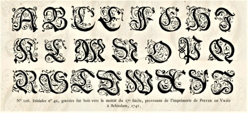
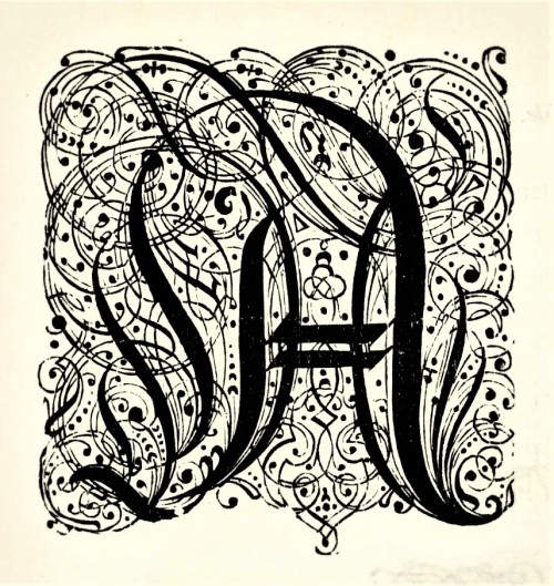
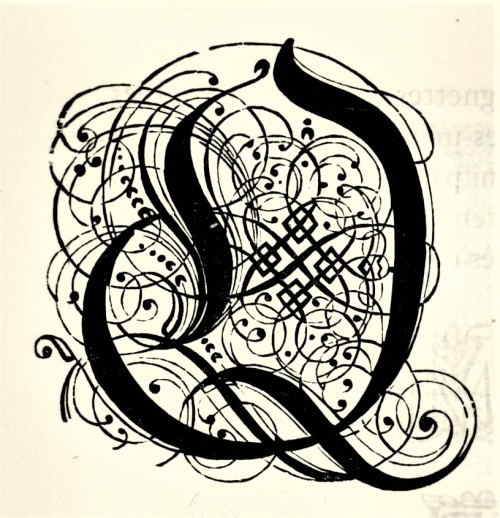
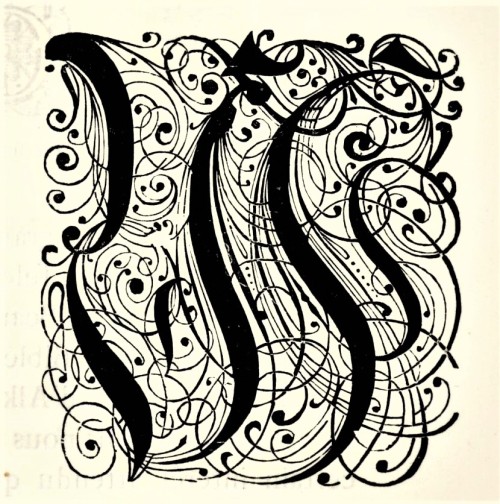
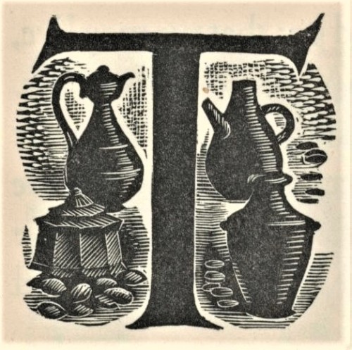
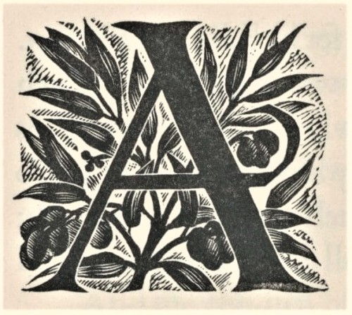
Here are some fancy, schmancy wood-engraved initials from our recent acquisition, Fonderies de caractères et leur matériel dans les Pays-Bas du XVe au XIXe siècle byCharles Enschedé (1855-1919), with specimens from the extensive typographic collection of the venerable 320-year-old printing and typefounding firm Joh. Enschedé en zonen, published in Harlem by De Erven F. Bohn in 1908.This title is one of type historian and designer Jerry Kelly’s recent One Hundred Books Famous in Typography (The Grolier Club, 2022).These highly calligraphic Gothic initials were engraved in wood in 1741 and were from the printing house of Pieter de Vries in Schiedam, Netherlands. Our copy of Fonderies de caractères is from the collection of New York artist Elijah Silverman and bears his signature.
View other posts related to the Enschedé firm.
Viewmore Typography Tuesday posts.
Post link
Typography Tuesday
ANNA SIMONS
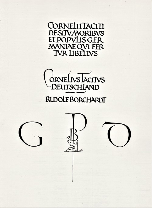
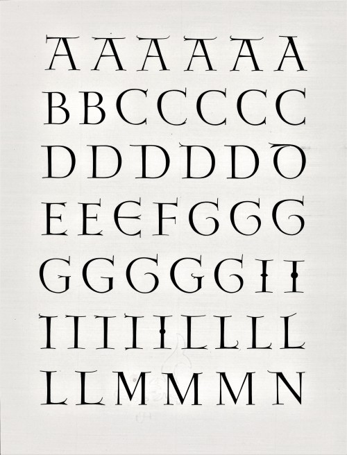
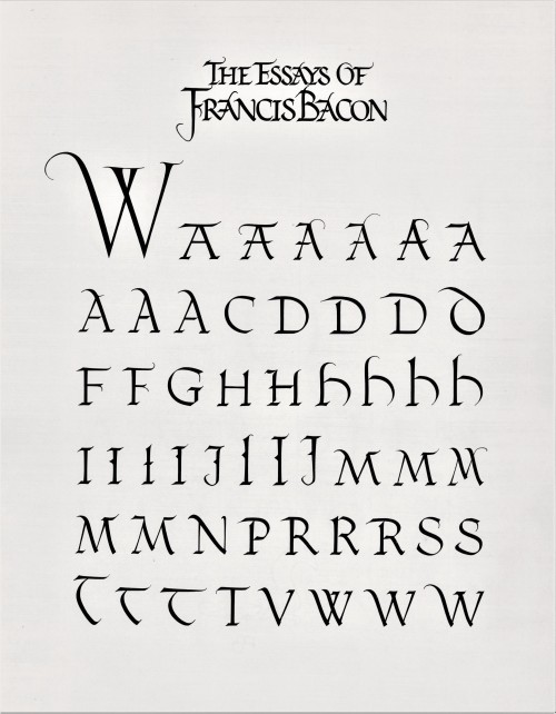
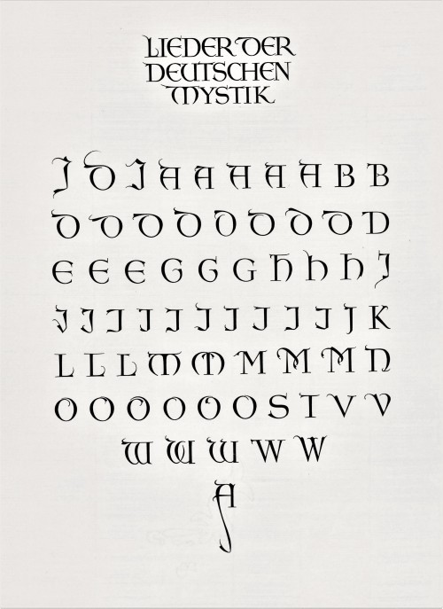
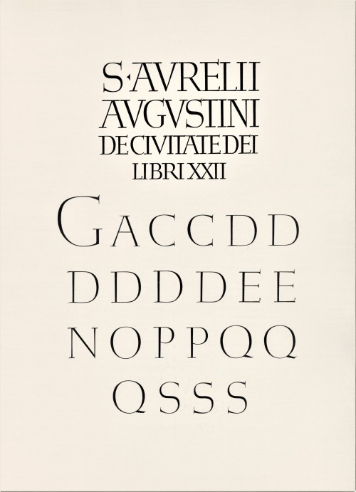
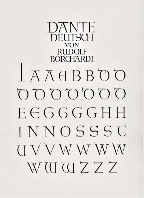
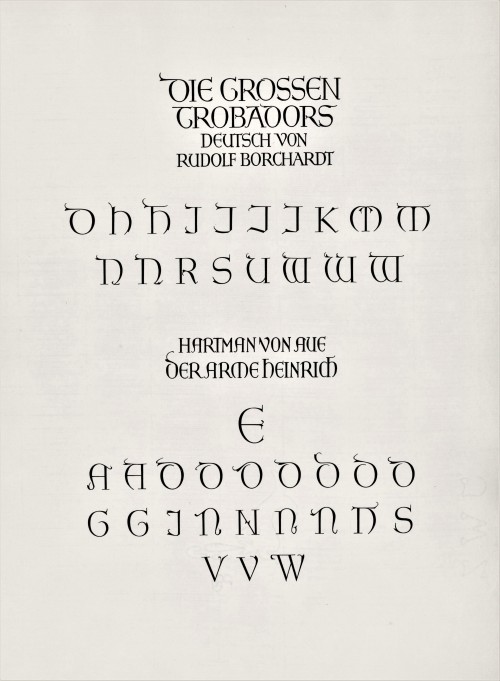
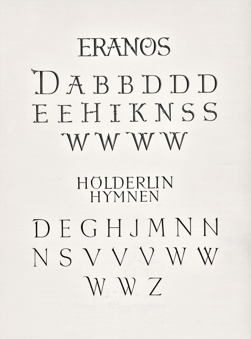
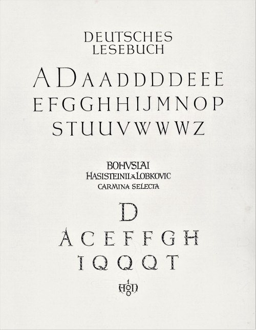
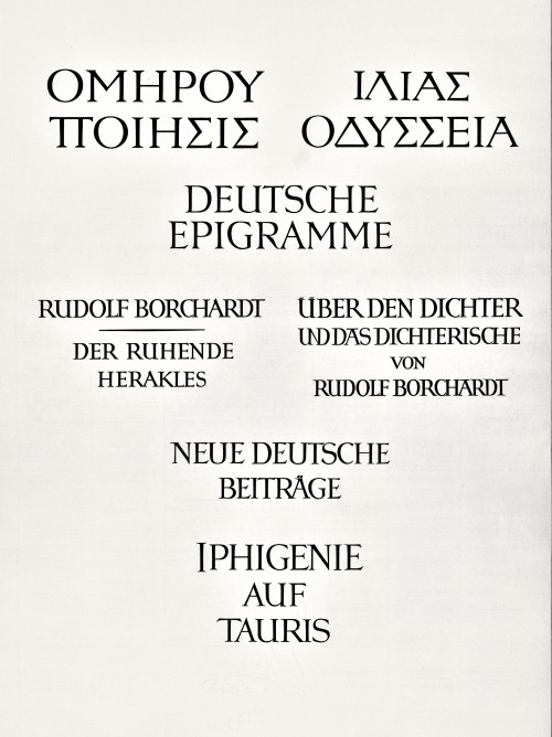
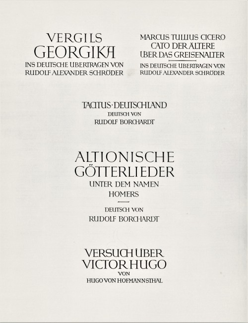
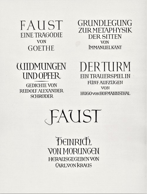
Today we present a few pages from a new acquisition, Titel und Initialen für die Bremer Presse, a specimen book of the titling and initials produced by the German calligrapher and type designer Anna Simons (1871–1951) for Willy Wiegand’sBremer Presse, printed letterpress in Munich at the Bremer Presse in an edition of 220 copies in 1926. A student of the renowned British calligrapher and type designer Edward Johnston, Simons taught Johnstonian design concepts at the Kunstgewerbeschule in Dusseldorf and later at Munich under the direction of German architect and type designer Peter Behrens. She began doing design work for the Bremer Presse beginning in 1918, and along with her assistant Franziska Kobell, Simons designed some 1400 titles and initials for the Presse. Simons continued to teach and work in Germany through the Nazi regime and died at 80 in Prien, Germany.
View more posts with designs by Anna Simons.
View posts on other Women Type Designers.
Viewmore Typography Tuesday posts.
Post link
Typography Tuesday
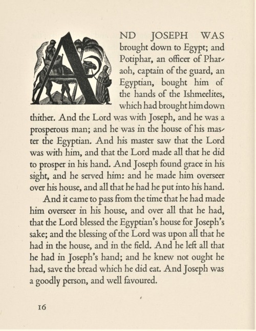
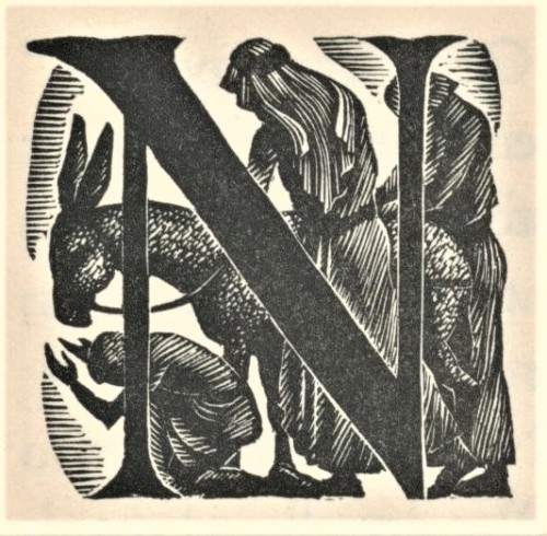
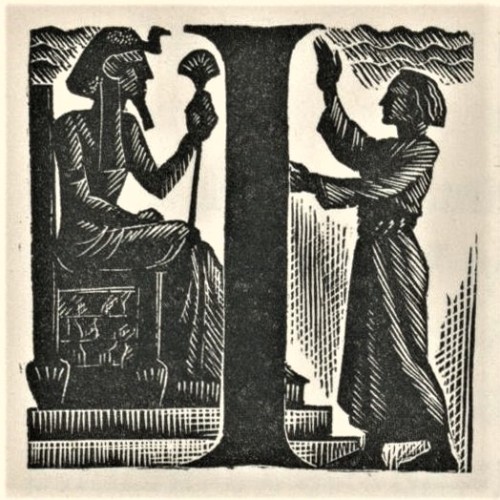
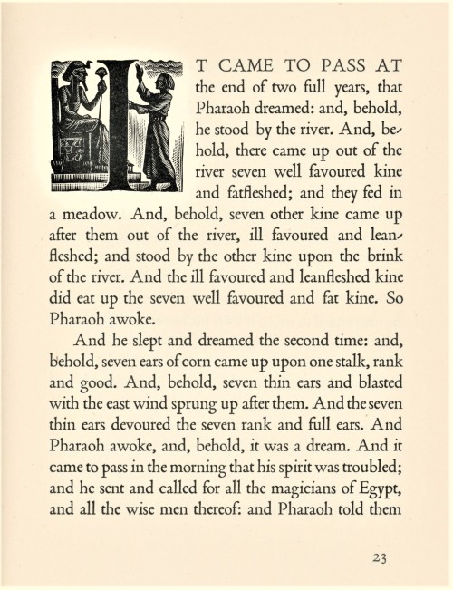
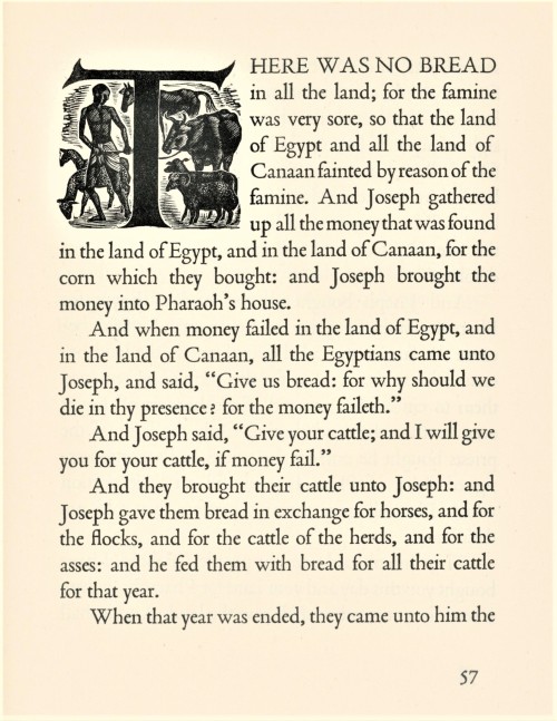
Last week we presented wood engravings by the English-American artist Nora S. Unwin (1907-1982) from Joseph; the King James Version of a Well-loved Tale, arranged with an introduction by her friend and frequent collaborator Elizabeth Yates, and printed and bound by the Plimpton Press in 1947 for Alfred A. Knopf in America and the Ryerson Press in Canada.
Today we present Unwin’s fine wood-engraved historiated initials for the chapter openings of the book. The initials mesh well with the solid stateliness and deep color of Stanley Morison’s Poliphilus typeface (released by Monotype in 1923), and integrates uniformly with Unwin’s engraved illustrations, creating a harmonious and holistic presentation to the entire production. This copy is another gift from our friend and benefactor Jerry Buff.
View more posts with historiated initials.
Viewmore Typography Tuesday posts.
View more posts with women wood engravers.
Viewmore posts with wood engravings!
Post link
Typography Tuesday
ANNA SIMONS, PART 2
This week we present the next ten of the twenty numbered plates in Titel und Initialen für die Bremer Presse, a specimen book of the titling and initials by the German calligrapher and type designer Anna Simons (1871–1951) for Willy Wiegand’sBremer Presse, printed letterpress in Munich at the Bremer Presse in an edition of 220 copies in 1926. We highlighted the first ten plates a couple of weeks ago.
For 15 years, Simons’s Arts & Crafts-inspired designs were important elements in the aesthetics of the Bremer Presse, and Weigand celebrated her contributions in this portfolio set of specimens during the middle of their collaboration. The press closed in 1934 and its assets were liquidated the following year. The studio building was destroyed in bombings during WWII. Simons, however, continued to teach and work in Germany through the war before her death in 1951.
View more posts with designs by Anna Simons.
View posts on other Women Type Designers.
View more Typography Tuesday posts.
Post link

